Napolitana
Cerealis
,
2023
Branding AWARDED BRONZE by PRÉMIOS LUSÓFONOS DA CRIATIVIDADE
A simple Portuguese flour brand with Italian taste.
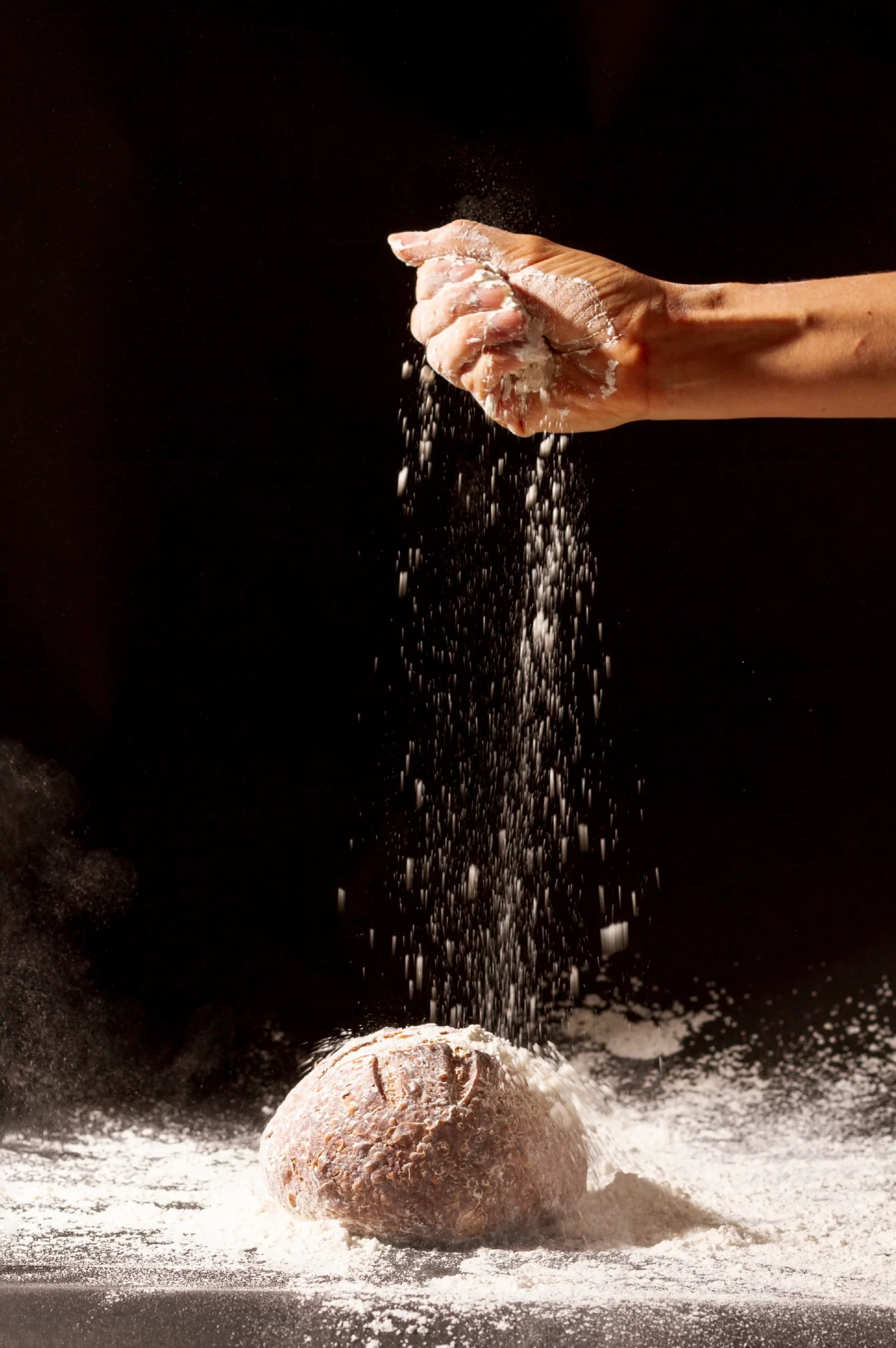
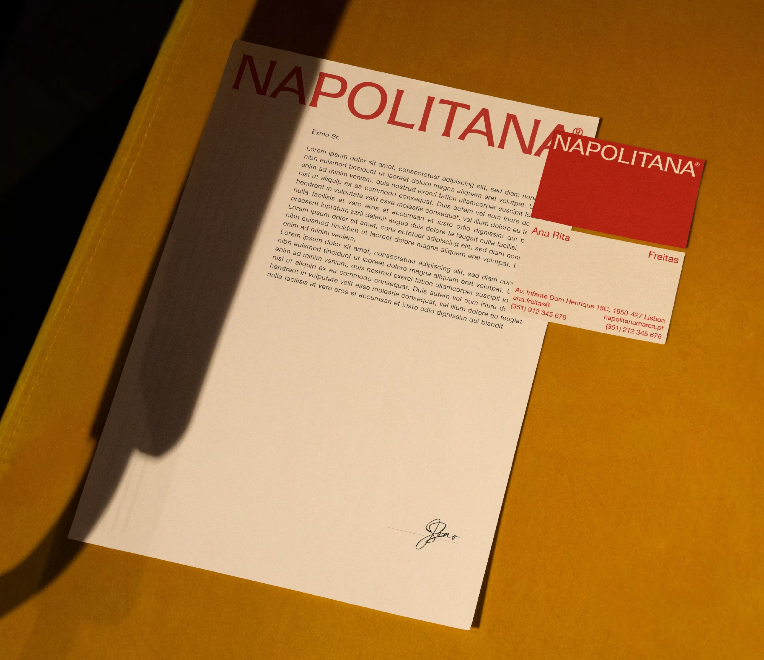
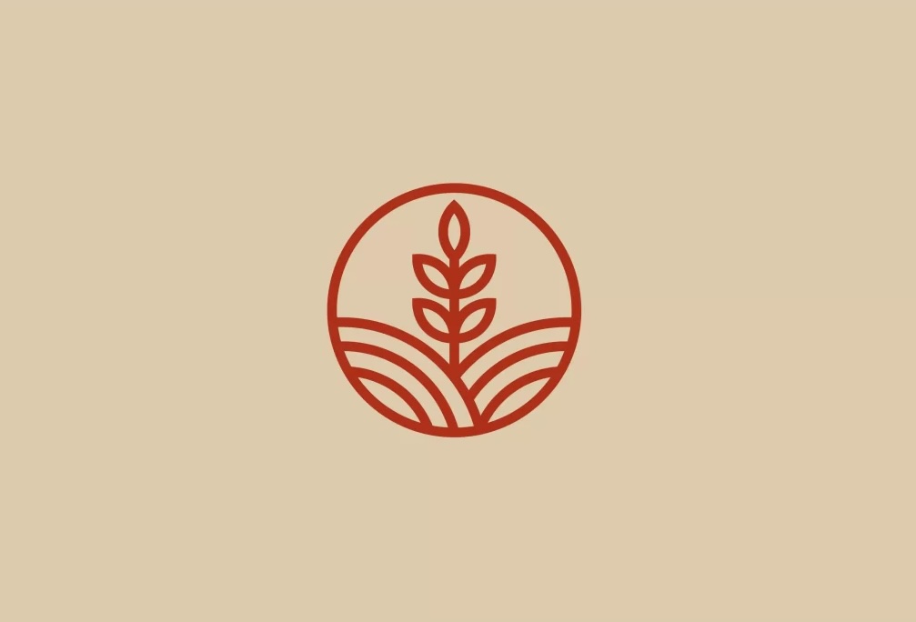
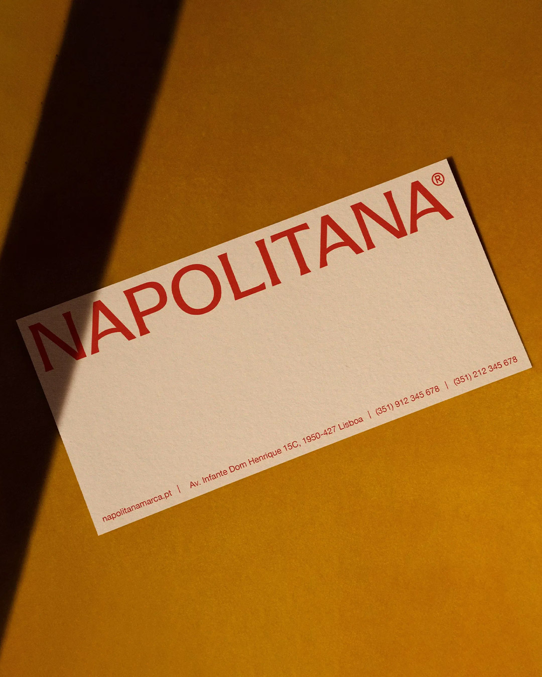
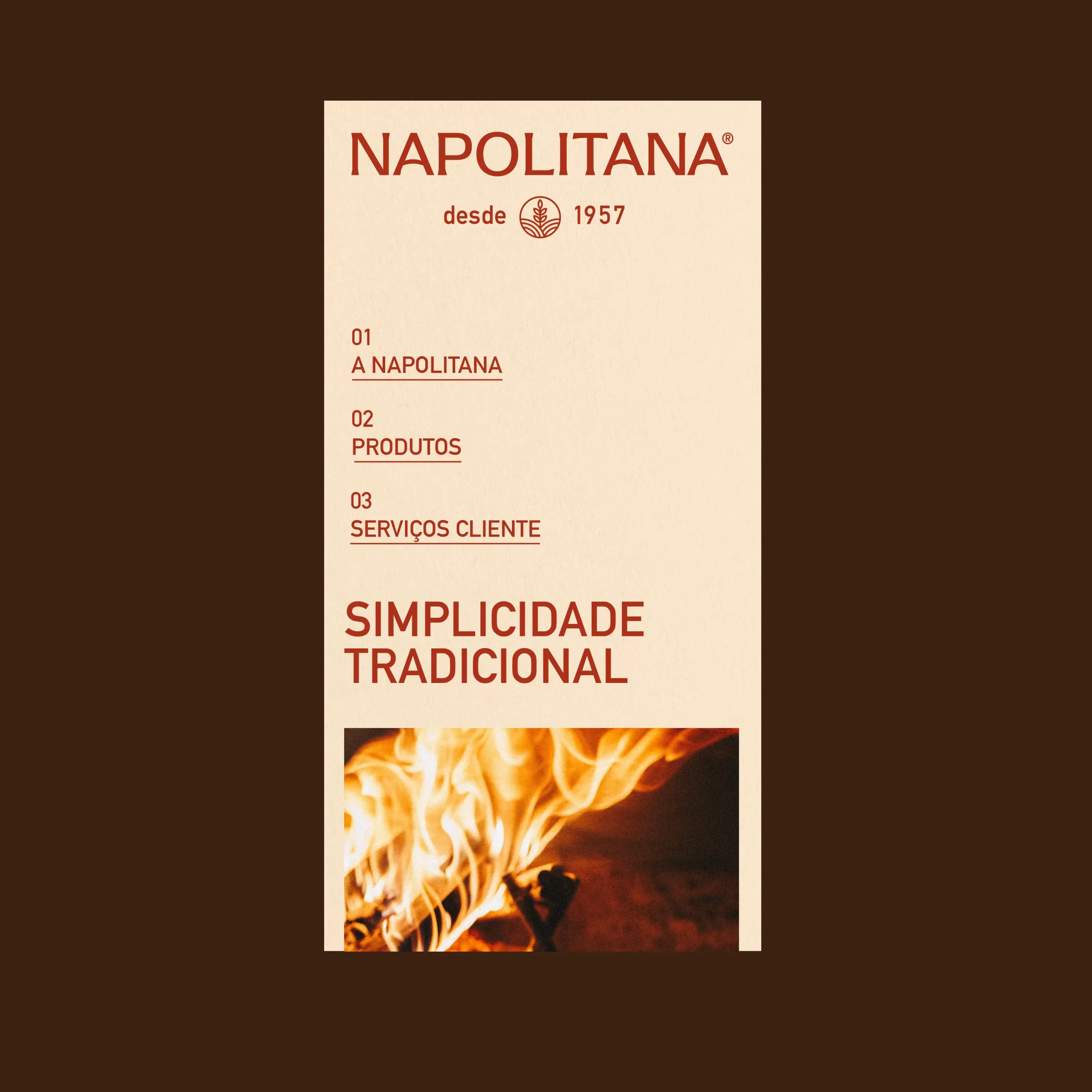

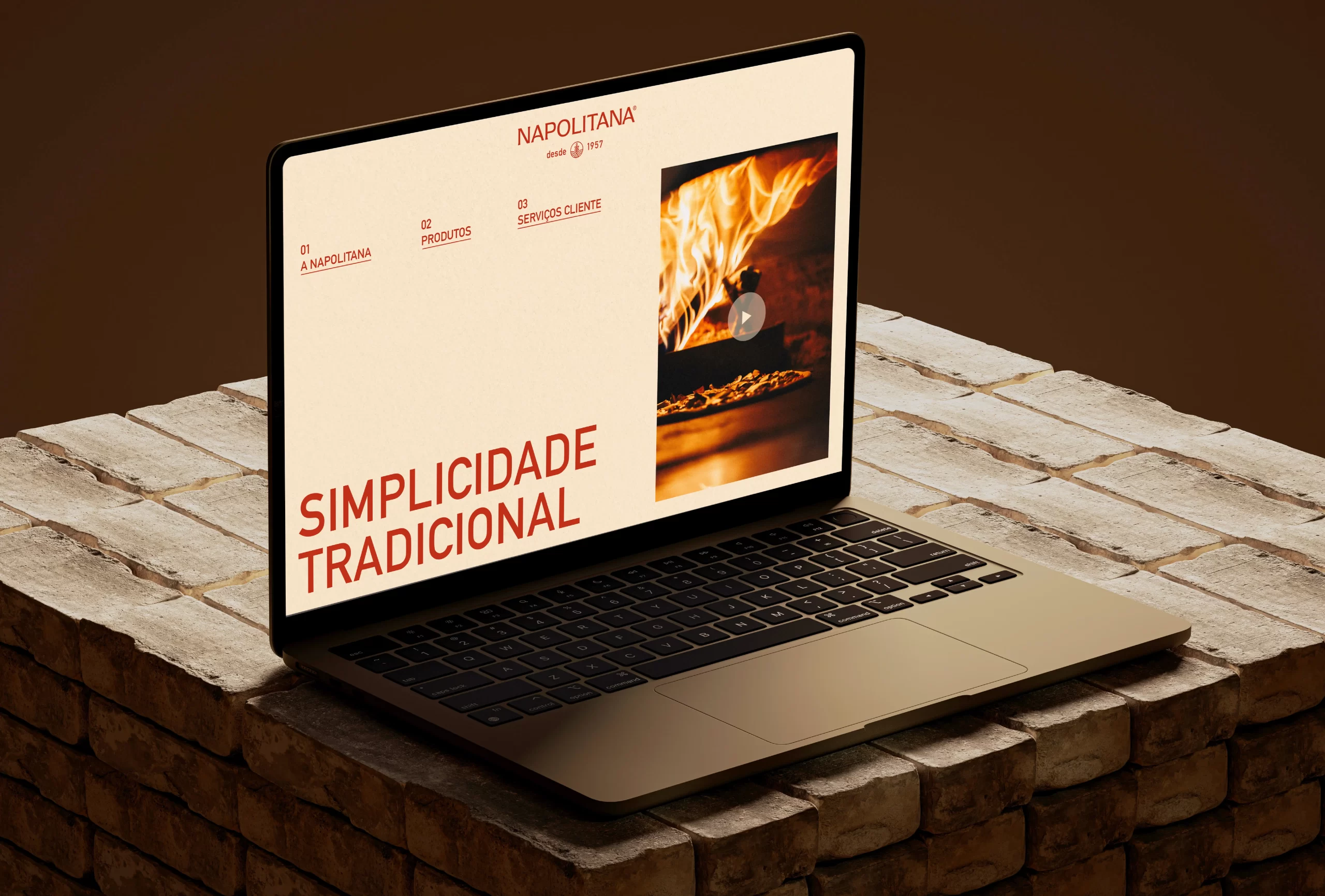
Napolitana is all about top-notch industrial flour crafted for pizza chefs to level up their recipes. It's all about quality and excellence with a fresh, innovative, and easy vibe. My job was to create a slogan, develop the brand identity - archetypes; brand colors; logo; icons; tone of voice; - packaging and website. Truly an end to end project. Napolitana follows the traditional methods for producing flour, so we created the slogan "Simplicidade Tradicional". It's all about keeping things real and perfect for those classic Italian recipes. The logo's font draws inspiration from typography found in ancient Roman architecture. Paired with a geometric symbol representing wheat fields, it completes the brand's visual identity. The packaging boasts a sleek and minimalist appearance, adorned with geometric patterns drawing inspiration from wheat fields. I went for a straightforward approach for the website. The aim is to provide a concise overview of the brand and its products.